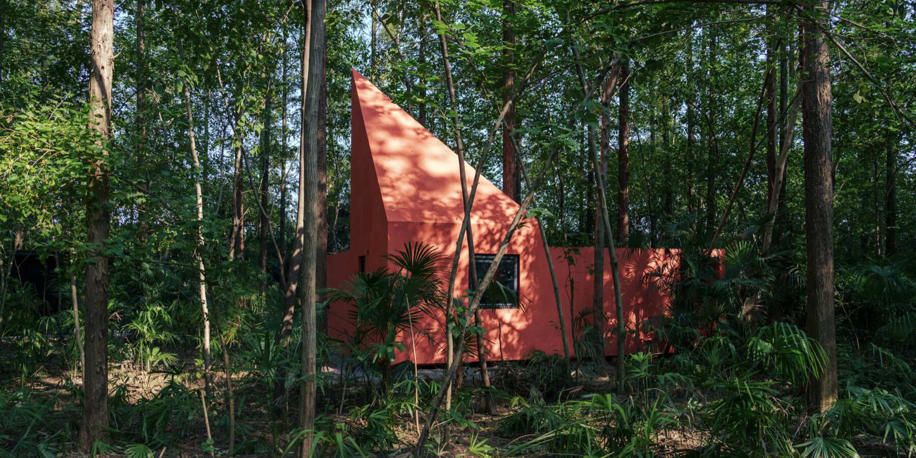
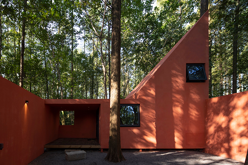
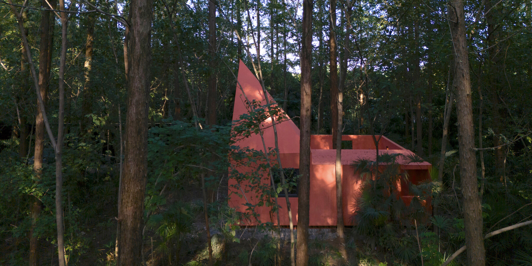
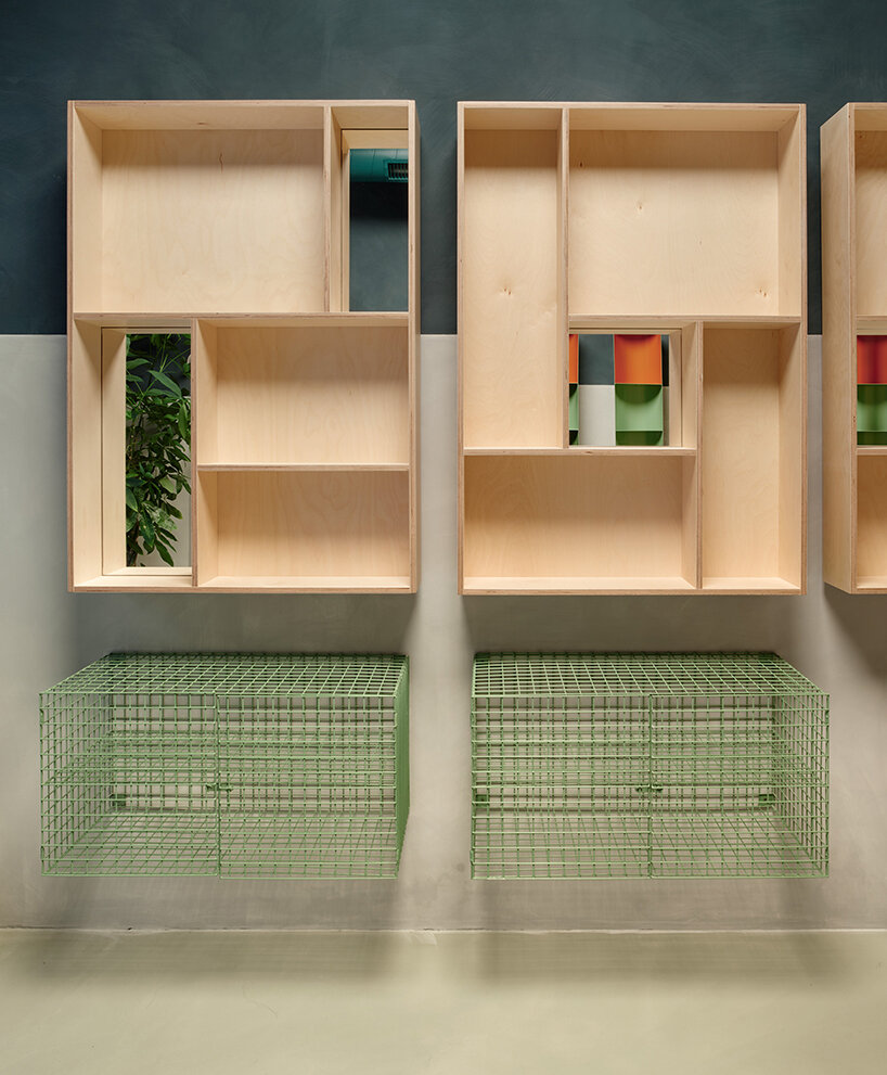
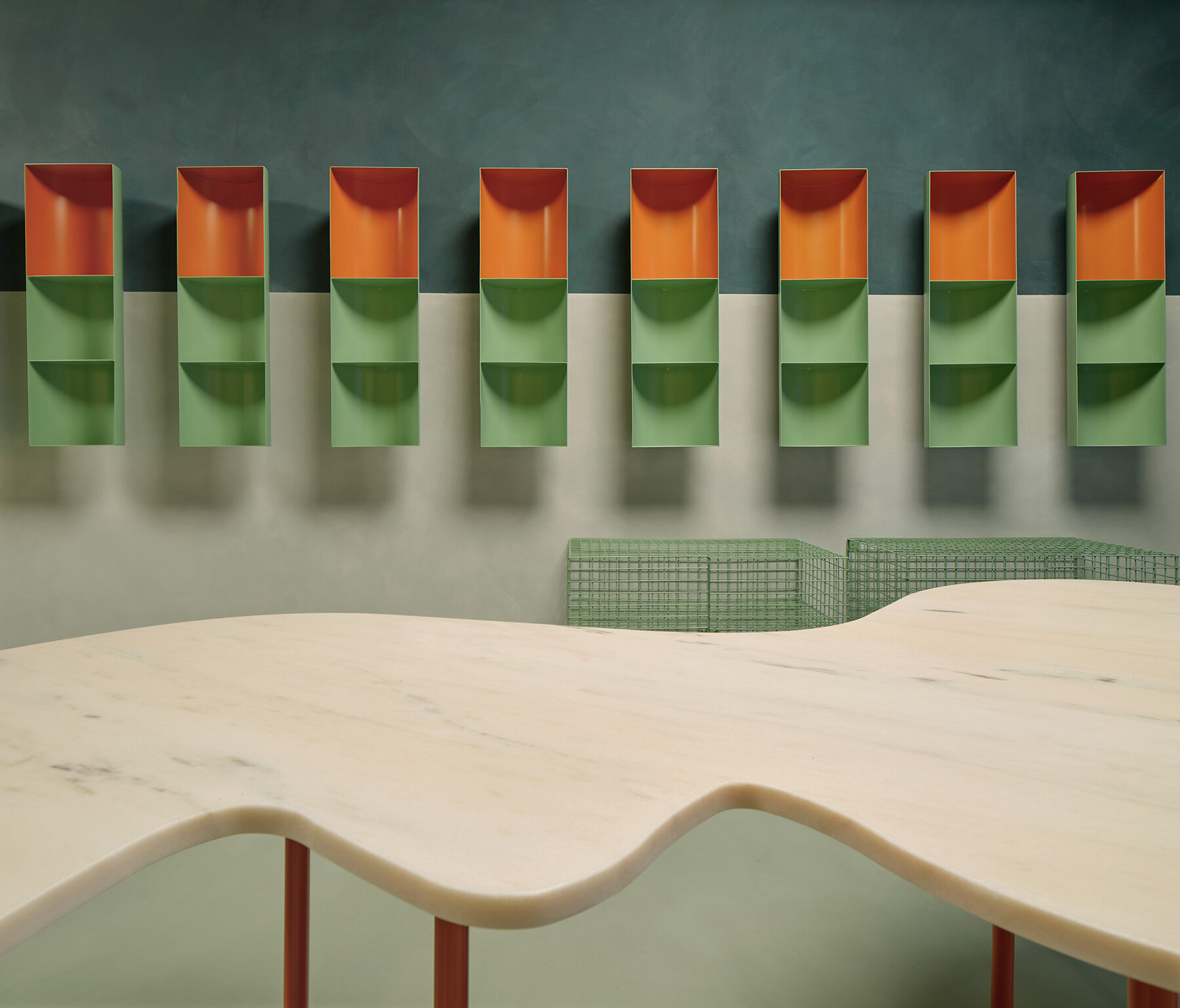
designboom’s top 10 public spaces of 2025
In 2025, public architecture asserts itself with renewed civic ambition, revealing how cultural institutions, parks, museums, and libraries are being reimagined for a rapidly shifting world. This year’s most compelling projects extend far beyond their physical footprints: they restore historic landmarks, rewrite urban narratives, and create new frameworks for collective experience — whether through adaptive reuse, socially driven programming, or architectural innovation at the scale of cities.
Across continents, architects are embracing porous edges, hybrid typologies, and participatory spaces that invite the public to inhabit them in unexpected ways. From the preservation of iconic modernist buildings and the debut of major cultural centers in Asia and Europe, to community-driven religious spaces and theatrical interventions in industrial ruins, the 2025 selection reflects a discipline increasingly attuned to memory, access, and transformation. Read on for designboom’s top 10 public spaces of the year.
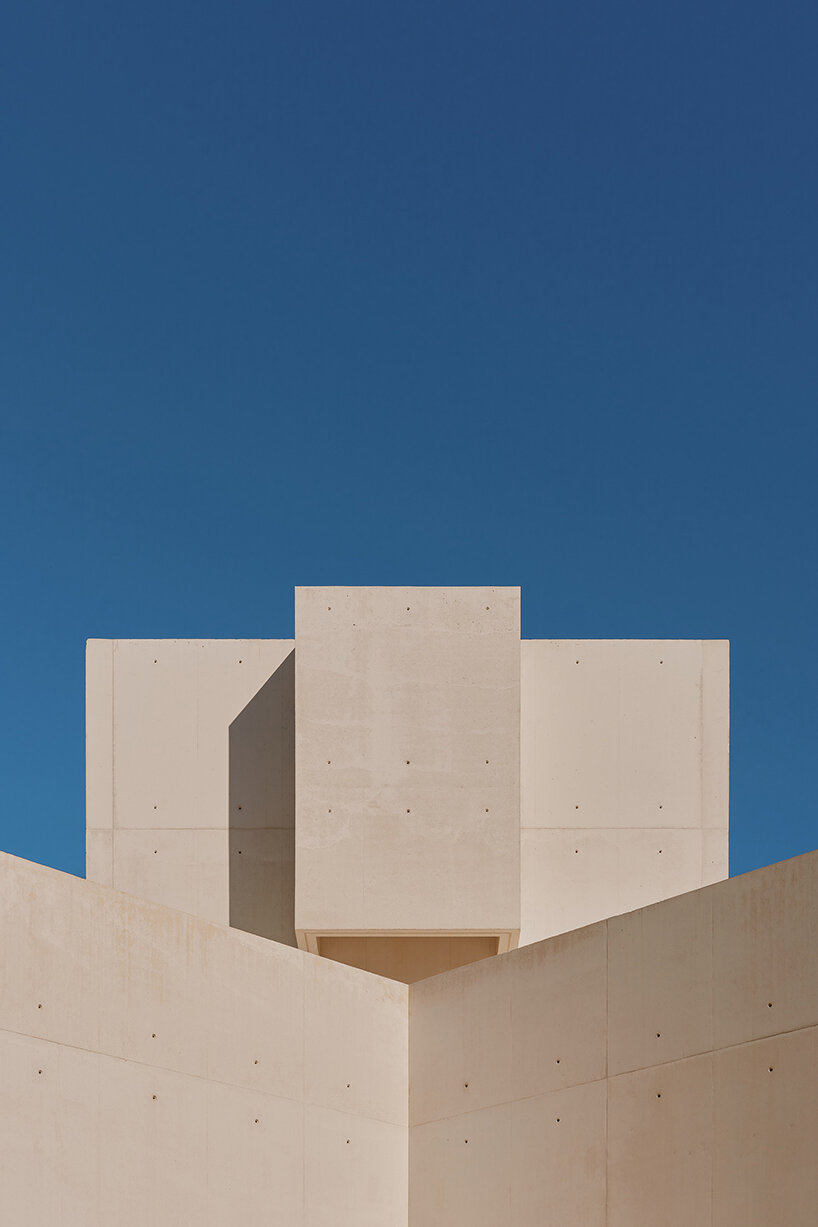
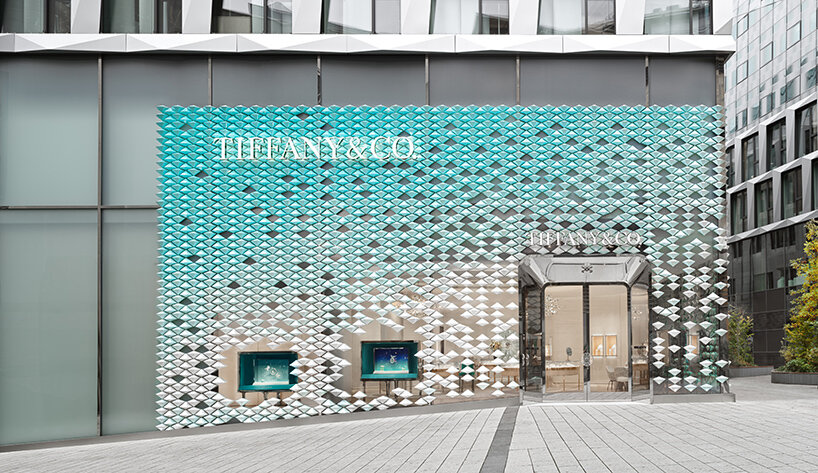
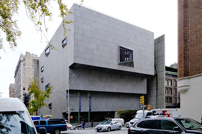
An icon of Brutalist architecture in New York, the Breuer Building reopens this week as the new global headquarters of Sotheby’s. The Marcel Breuer-designed museum has stood at 945 Madison Avenue since 1966, and has since been home to the Whitney Museum of American Art, The Metropolitan Museum of Art, and The Frick. Its latest transformation by Herzog & de Meuron marks the continuation of its public legacy. designboom attended a preview of the renovated building to learn about the project from the teams at Herzog & de Meuron and Sotheby’s.
‘This building is an example of postwar modernism and Brutalism with a very distinct beauty,’ says architect Wim Walschap, Senior Partner at Herzog & de Meuron. ‘It has endured as an icon and much-loved landmark in New York. Our goal was to preserve the building’s integrity, its purpose, and legacy, while preparing it for a dynamic new use that puts art at the center.’
Breuer Building renovation, Sotheby’s HQ, Herzog & de Meuron, image © designboom
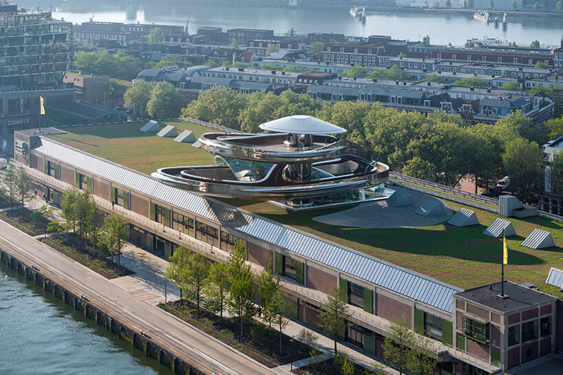
On May 16th, 2025, Rotterdam officially opens Fenix, a museum dedicated to the art and stories of migration, marking MAD’s first cultural building in Europe. Ahead of the public opening, designboom previewed of the museum to experience the space firsthand and speak with architect Ma Yansong on site.
Activating a 1923 port warehouse in the historic Katendrecht district of the city, the project is a milestone in the regeneration of Rotterdam’s waterfront and reflects the layered history of the site, once the departure point for millions of emigrants crossing the Atlantic.
The Tornado, a dramatic double-helix staircase, crowns the Fenix museum. This centerpiece pierces through the old warehouse and flows upward, culminating in a rooftop platform, offering views over the city. ‘The people’s behavior and reactions complete the work,’ Ma Yansong tells us. ‘Otherwise, it’s just a staircase.’ See designboom’s coverage of the museum as it came alive in Rotterdam here.

Fenix, MAD Architects, image © Iwan Baan
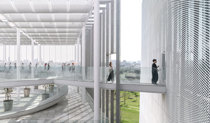
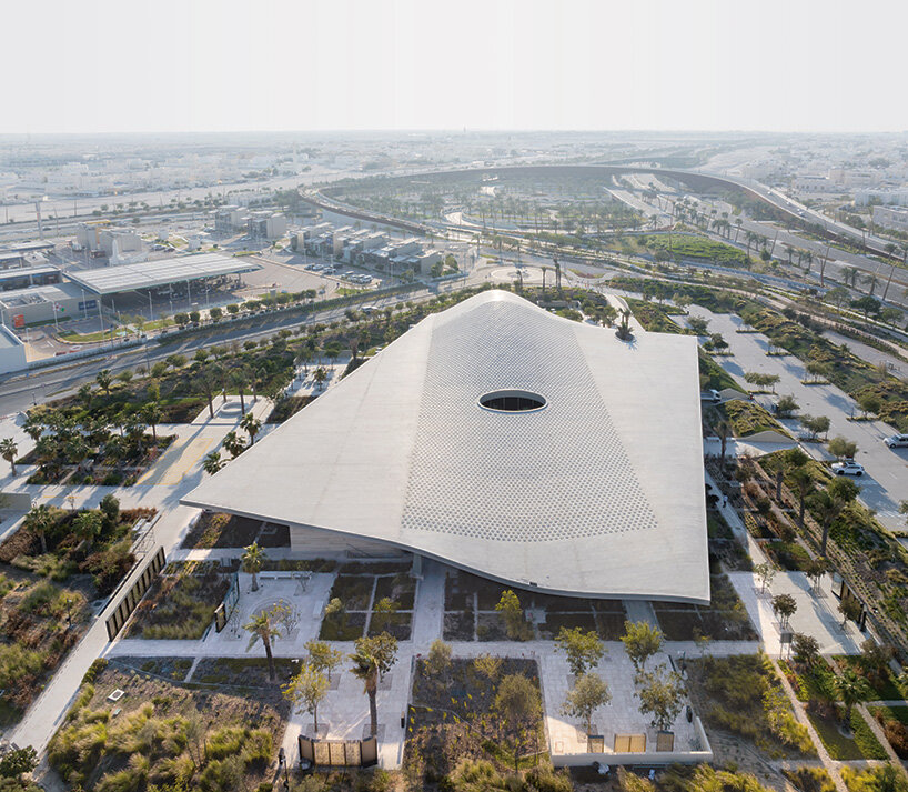
SANAA unveils Taichung Art Museum, part of the newly completed Taichung Green Museumbrary, set to open on December 13th, 2025. Located in Taiwan’s second-largest city, the project integrates the city’s central library with a metropolitan art museum, establishing a combined cultural facility that presents a new institutional model.
The Taichung Green Museumbrary sits on the northern edge of Central Park, a 67-hectare green space within the 254-hectare Shuinan Trade and Economic Park, formerly a military airport decommissioned in 2004. Positioned at the heart of this redevelopment area, the project has been described as Taiwan’s most significant cultural initiative of 2025.
SANAA’s design follows the guiding idea of creating ‘a library in a park and an art museum in a forest.’ The building is lifted above ground level, allowing natural light and park breezes to move freely through shaded plazas that provide open, permeable access from all sides.

Taichung Art Museum, SANAA, image © YHLAA – Yi Hsien Lee
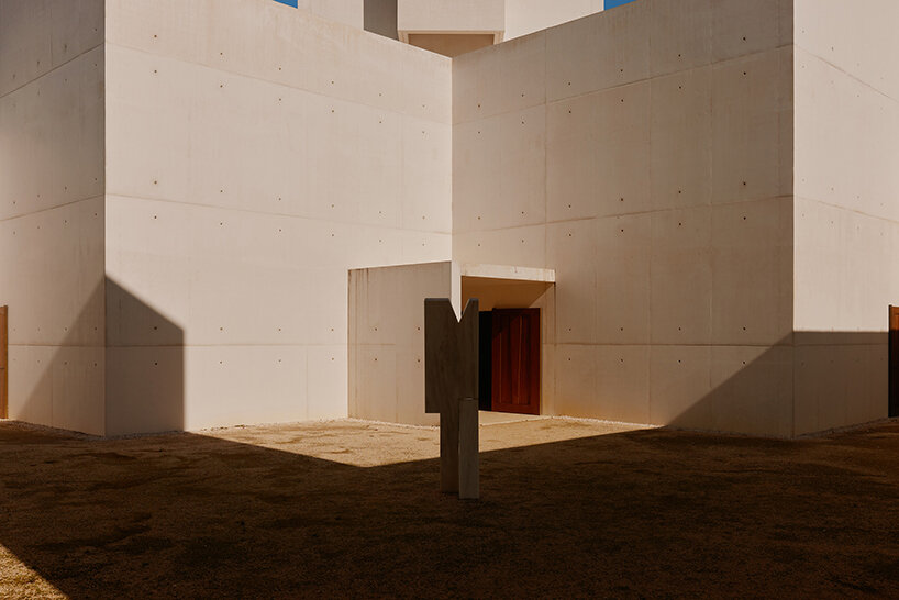
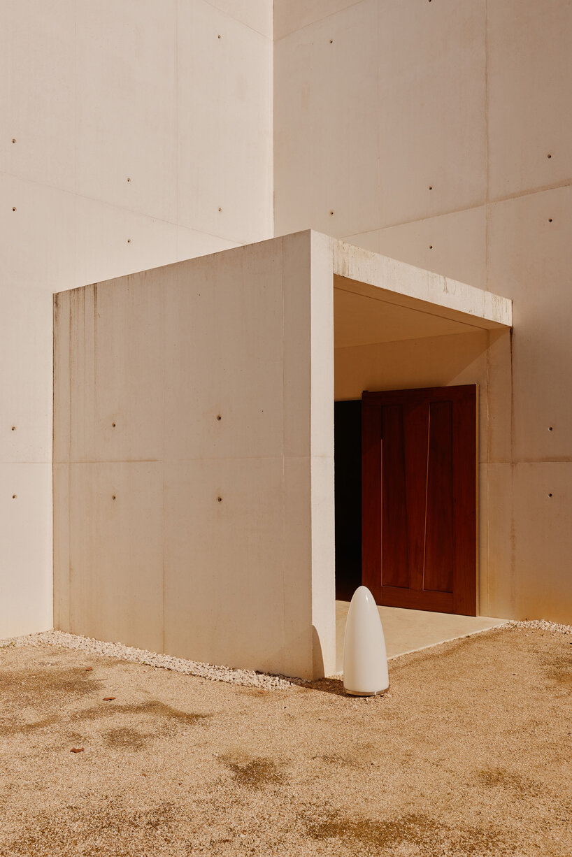
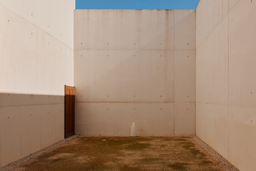
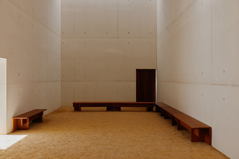
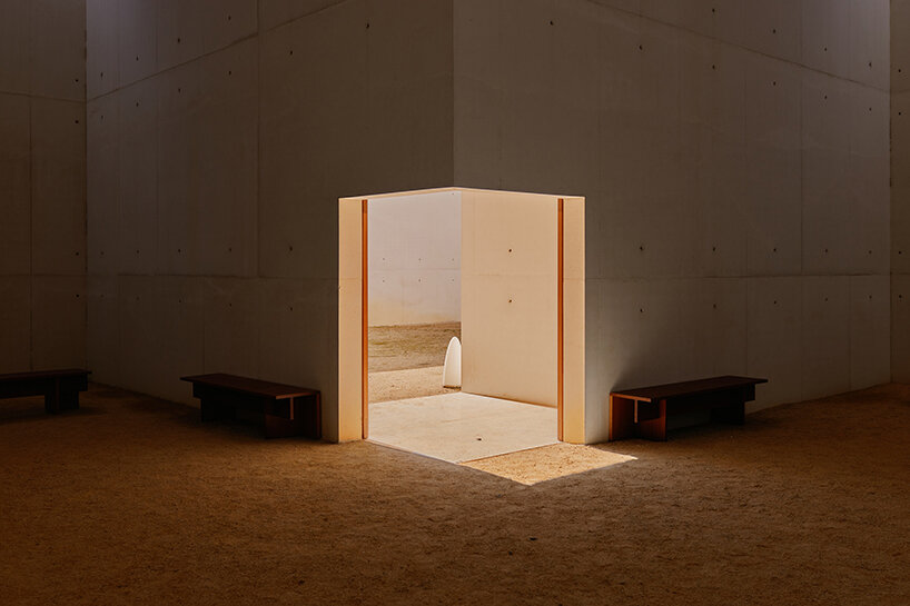
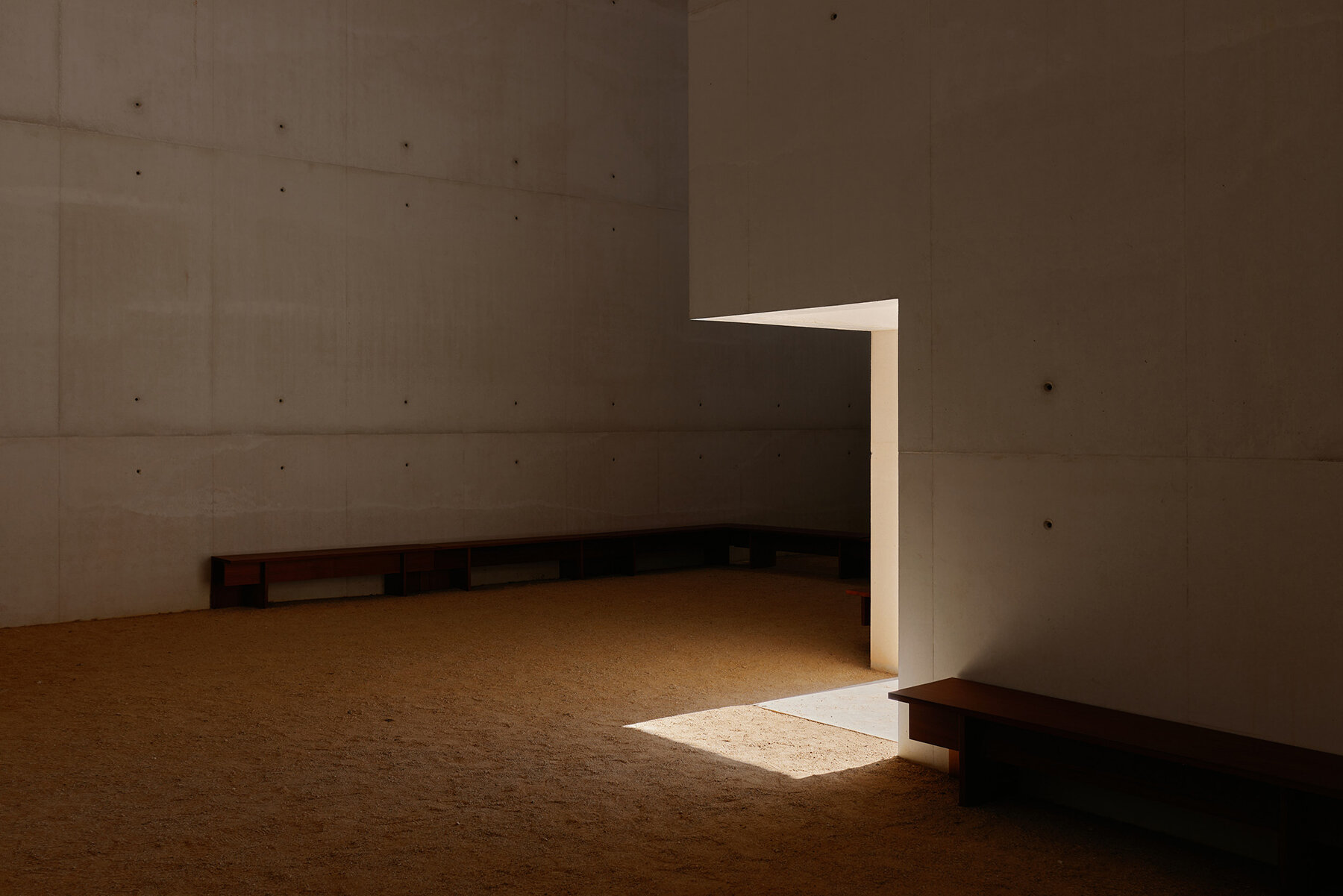
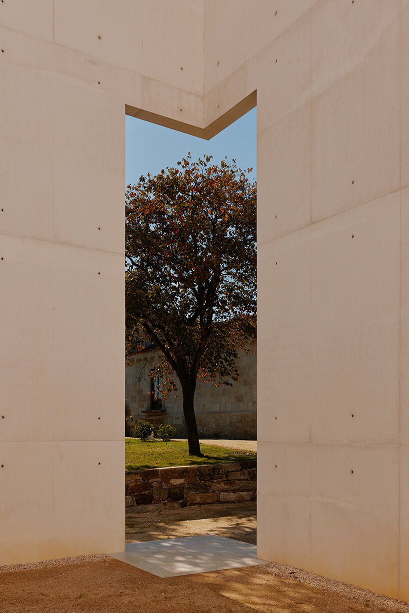
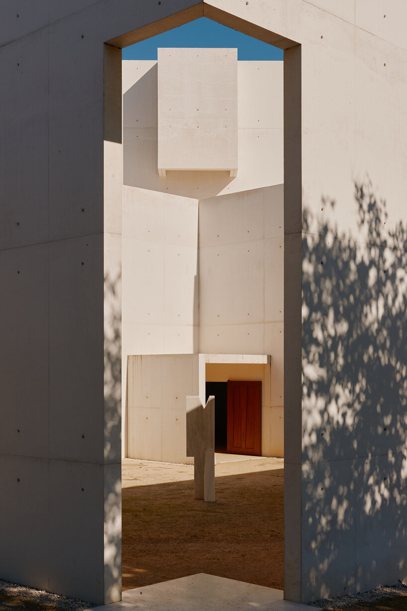
In the heart of Doha’s Education City, designboom steps inside the Al-Mujadilah Center and Mosque for Women, a groundbreaking space designed by Diller Scofidio + Renfro (DS+R). Spanning 4,600 square meters, the project is built to empower women through worship, education, and community.
It is the first mosque built specifically for women in the Muslim world. The building combines traditional elements with a forward-thinking spatial language, reflecting Islamic values of sincerity (ikhlas), service (khidma), and knowledge (ilm), while also addressing the evolving needs of women in religious, educational, and social domains.
‘To make a mosque for women was a really big challenge. It’s the first purpose-built women’s mosque anywhere, and we were very drawn to that. It’s also a hybrid building — a place for education and work,’ Elizabeth Diller, co-founder of DS+R tells designboom during our tour at the Al-Mujadilah Center and Mosque for Women in Doha. ‘Bringing those together under one roof, with classes and discourse and debate, was very important, because there was really no space for that to happen.’
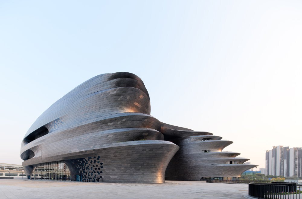
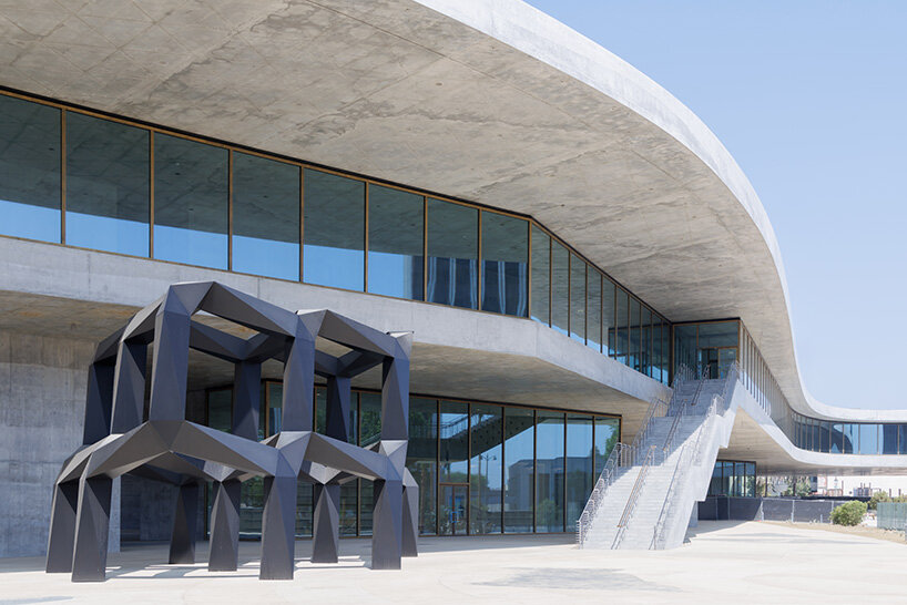
The Shenzhen Science & Technology Museum opens within the Guangming District as a new major cultural and civic institution that highlights the scientific achievements, cutting-edge research, and innovation shaping the future. Situated at the southeastern edge of the city’s new Science Park, the Zaha Hadid Architects-designed museum is built as a landmark for the district.
A solid, spherical form facing the city defines its urban presence, while to the west, the building opens outward into a series of undulating terraces overlooking the park. It is wrapped in a dual-colored stainless-steel skin — the first large-scale application of INCO technology in China. This skin features a subtle gradient from deep blue to gray, and is meant to evoke the movement of celestial bodies.
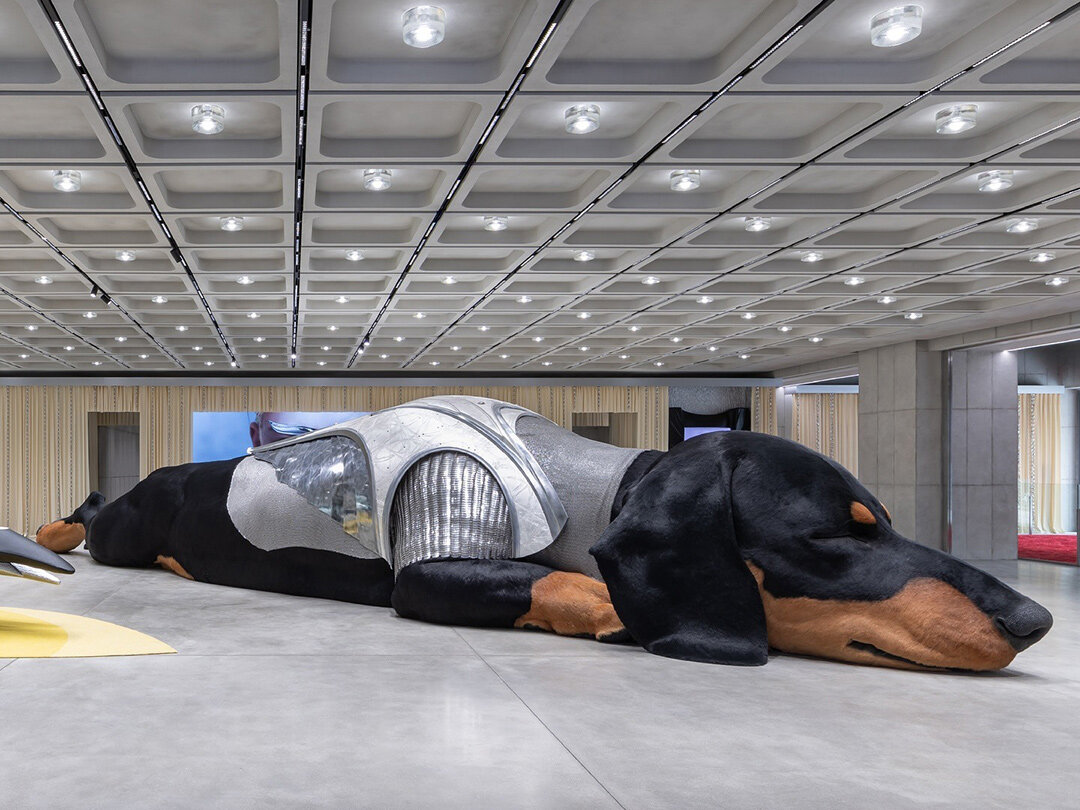
Gentle Monster’s parent company, IICOMBINED, launches Haus Nowhere Seoul in Korea, marking the first architectural chapter of its long-term Future Retail vision. Conceived as ‘a space found nowhere,’ the venue merges art, design, and commerce into an experimental environment.
Inside its multi-story building, visitors encounter Max Siedentopf’s More Is More, a surreal landscape of swelling plastic bags animated by a hyperreal elderly man; Sunshine, a monumental dachshund who drifts between fairytale scenes and futuristic transformations; and Nudake Teahouse, a kinetic, color-saturated lounge that transforms the ritual of tea into a sensory performance.
The presence of a giant dachshund threads through multiple levels the space. Introduced by Tamburins, the character first appears in a whimsical slumber, rendered with a dewy nose, soft paws, and gentle breaths, before re-emerging in a ‘parallel universe’ clad in shining armor, recast as a futuristic warrior. Visitors can step into Sunshine’s world through an AI-powered Twin Look photo booth, where the dachshund mirrors their appearance in sticker-like portraits.
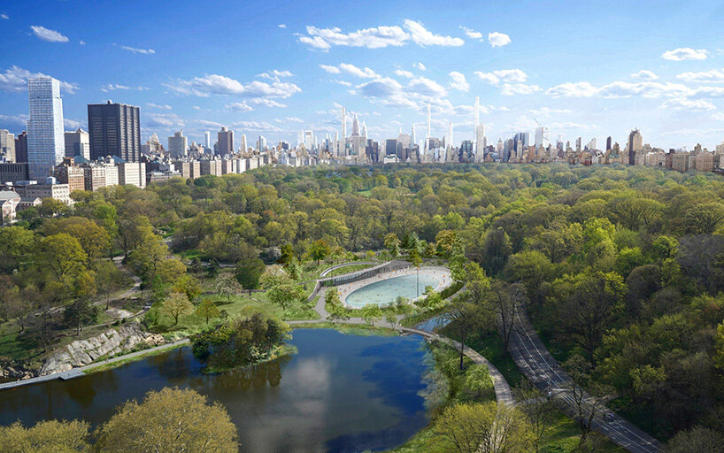
In April, 2025, New York City officially opened a major addition to Central Park, the Davis Center at the Harlem Meer. Designed by architect Susan T Rodriguez in collaboration with Mitchell Giurgola, the renovation project replaces the old Lasker Rink and pool with a recreational facility that’s built directly into the landscape, restoring nature, reconnecting paths, and creating a year-round space for community activity.
At the heart of the new design is a transformative water feature that shifts with the seasons, from a skating rink in winter to a lush green lawn in spring and fall and a pool in the summer.
Located at its northeast corner, the new Davis Center is part of a broader initiative by the Central Park Conservancy to restore the landscape, enhance ecological health, and reopen one of the most picturesque, yet historically overlooked, areas of Manhattan’s beloved park.

Davis Center, Susan T Rodriguez, Mitchell Giurgola, image courtesy Central Park Conservancy
The Fondation Cartier pour l’Art Contemporain’s new building, designed by Jean Nouvel, opens on October 25th, 2025, at 2 Place du Palais-Royal, Paris. The architectural project for the institution reinvents the 19th-century Grands Magasins du Louvre as a mobile organism.
Exposition Générale, the inaugural exhibition, designed by Formafantasma, brings together over 600 works by more than 100 artists, including David Lynch, Claudia Andujar, Sarah Sze, Cai Guo-Qiang, Junya Ishigami, Giuseppe Penone, and Diller Scofidio + Renfro to map forty years of contemporary creation through a scenography that reactivates the very notion of what a museum can be.
Jean Nouvel’s architectural transformation of the Fondation Cartier’s new home reimagines the Haussmannian landmark as a kinetic machine for art. Within the restored shell of the former Grands Magasins du Louvre, Nouvel introduces a system of five monumental moving platforms that rise and descend to endlessly reshape the exhibition spaces.

Fondation Cartier pour l’Art Contemporain, Jean Nouvel, image © Martin Argyroglo
Peter Zumthor’s long-awaited redesign of the Los Angeles County Museum of Art (LACMA) takes a step forward as LACMA reveals the David Geffen Galleries, its new architectural centerpiece, before art installation begins ahead of the grand public opening in April 2026 (find designboom’s previous coverage here).
Images by Iwan Baan offer the first interior look at the museum’s 10,220-square-meter exhibition level. LACMA welcomed the public to select areas of the new building in summer 2025, signaling a gradual activation of the most ambitious architectural transformation in its history. The museum is now home to Jeff Koons’ Split-Rocker, a towering 37-foot-tall sculpture covered in over 50,000 living plants.

Los Angeles County Museum of Art (LACMA), Peter Zumthor, image © Iwan Baan
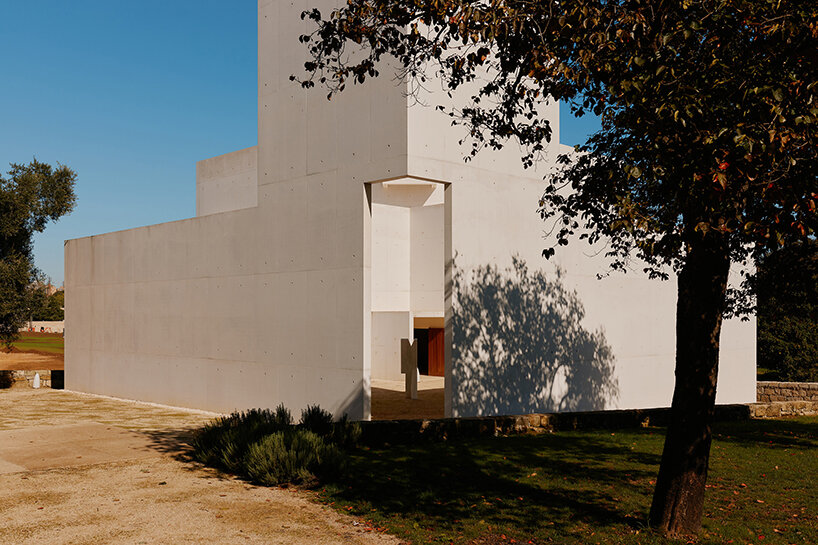
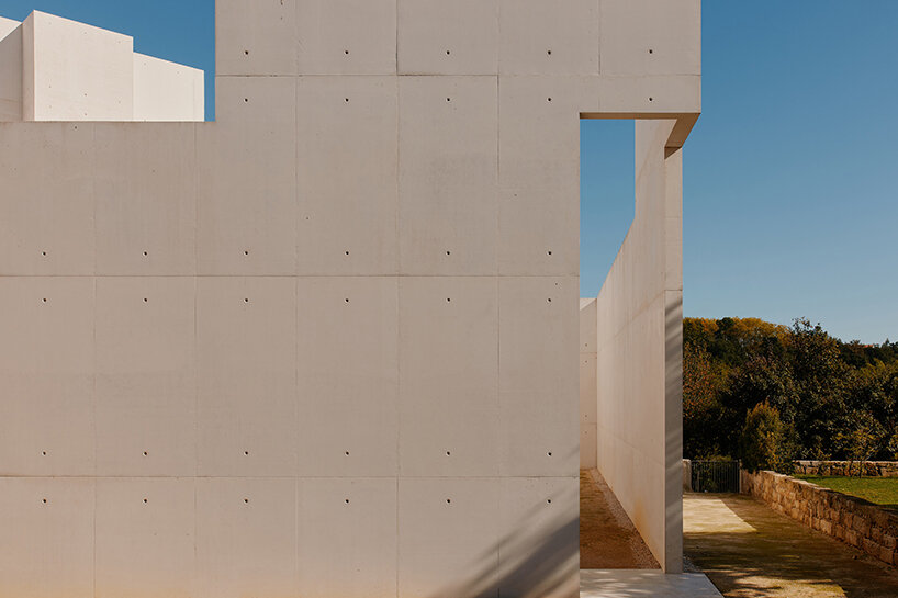
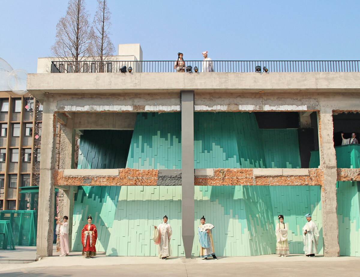
Verdant Ridges by Wutopia Lab’s Wuto-mills is built within the concrete ruins of the historic Xinguang Silk Weaving Factory, revitalizing an industrial structure into a contemporary theater. Located within Suzhou’s Taohuawu district in China, the project offers a fresh approach to architectural restoration, reinterpreting its material history, rather than treating the factory as a fixed artifact, by interweaving symbolic references and various stylistic narratives.
Verdant Ridges’ interplay of contrasts stems from the artistic philosophy of Ming Dynasty painter and poet Tang Bohu, who developed a style combining disciplined brushwork with expressive color, completing distinct monochrome landscapes and vivid figure paintings.
The exterior landscape, sculptural and layered, deeply speaks to this history, featuring a foreground of perforated metal mesh alluding to an abstracted mountain silhouette, with solid cladding behind it. Inside the theater, the palette shifts to more theatrical yet subdued tones of black, white, and gray that allow the performances to take visual precedence.

Verdant Ridges by Wutopia Lab, image © Liu Guowei
The post TOP 10 public spaces of 2025 appeared first on designboom | architecture & design magazine.