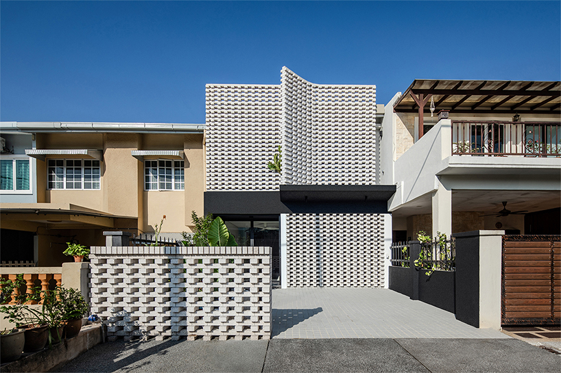
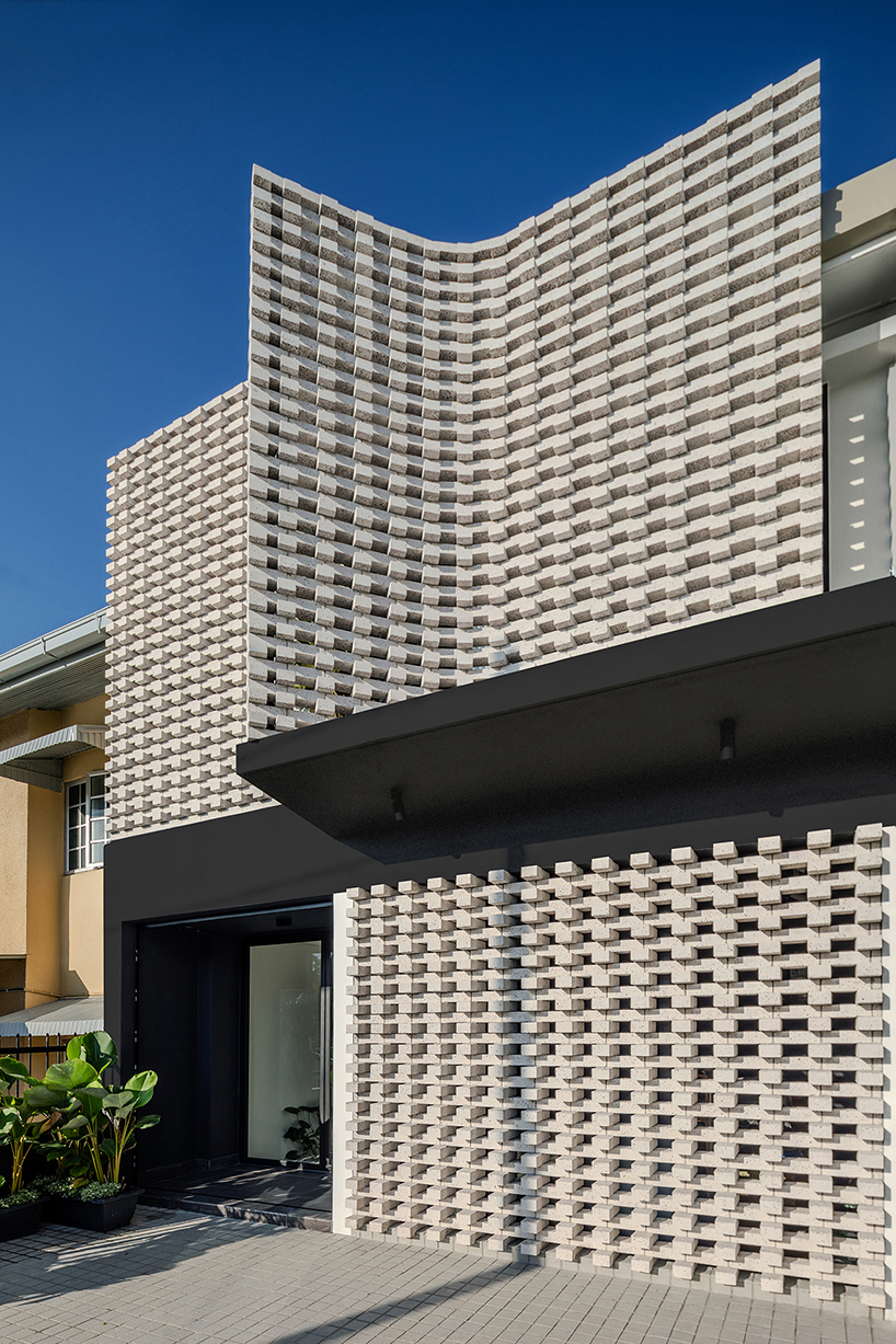
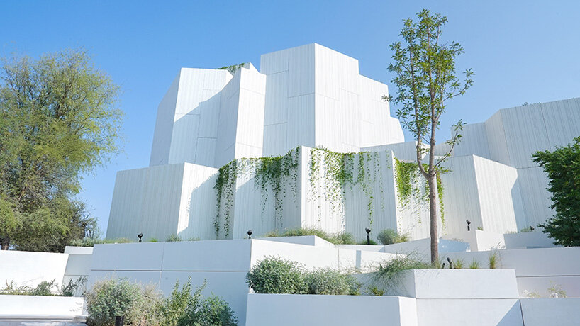
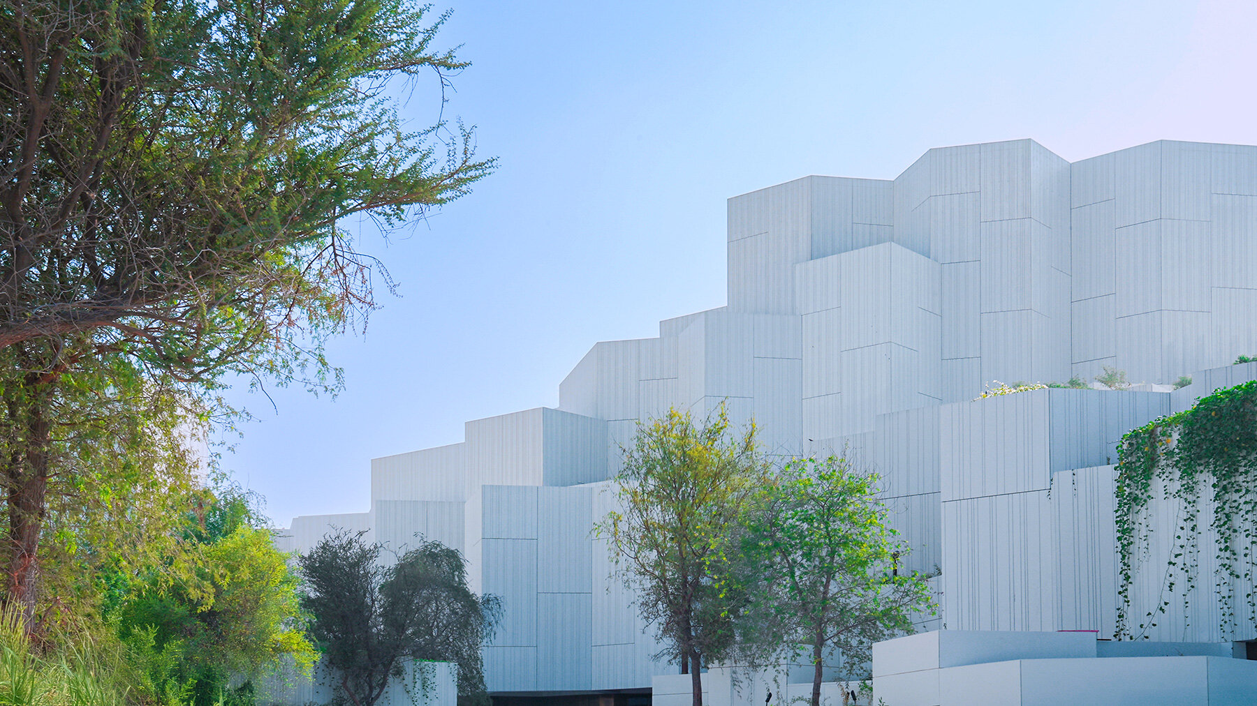
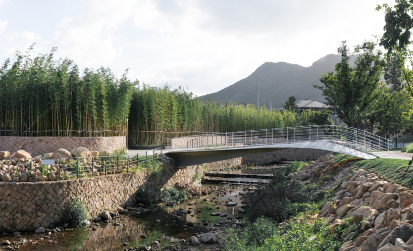
porous white brickwork facade enfolds renovated 1980s terrace house in kuala lumpur
6IX Design Office Reconfigures a Kuala Lumpur Terrace House
Teresformasi is a renovation project of a 1980s terrace house in Melawati, Kuala Lumpur, designed by 6IX Design Office. Positioned near the Bukit Tabur Quartz Ridge, the project reinterprets a common intermediate-lot terrace home through spatial reprogramming and material continuity. Its name combines teres (terrace) and transformasi (transformation), reflecting its focus on updating an existing typology for contemporary Malaysian living.
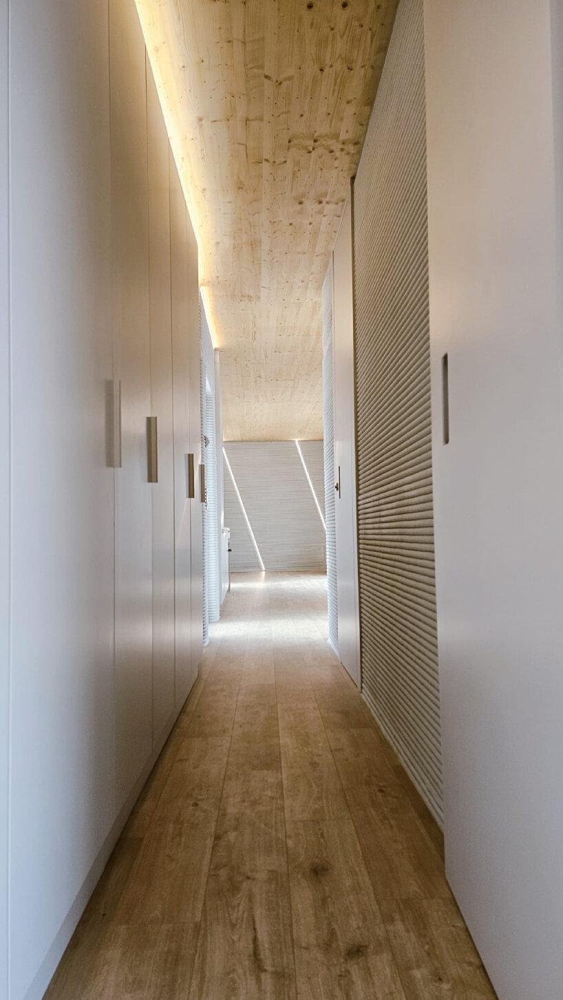
The design centers on an airwell that acts as the primary organizing element, distributing daylight and natural ventilation throughout the interior. Circulation and room arrangements are structured around this void, employing a clear served-and-servant hierarchy. Communal areas such as the living room and kitchen are configured as open, interconnected spaces, while private and service areas remain compact and efficient.
Teresformasi renovates a 1980s terrace house in Melawati, Kuala Lumpur | all images courtesy of 6IX Design Office
6IX Uses Brick, Timber, and Concrete for the transformation
The design team selects the materials for both their environmental performance and spatial coherence. Brick, timber, and concrete form the main palette, with recycled chippings incorporated into the brickwork to create a terrazzo-like finish. These materials allow for durability and contribute to passive thermal moderation. A secondary facade skin further reduces heat gain while maintaining access to natural light.
The project maintains the character of the original terrace-house form while addressing contemporary functional requirements. Its approach demonstrates how existing housing stock can be adapted through targeted spatial adjustments rather than expansion. For 6IX Design Office, Teresformasi serves as an exploration of incremental transformation and the architectural potential of everyday residential structures.
the project reinterprets a typical intermediate-lot terrace home
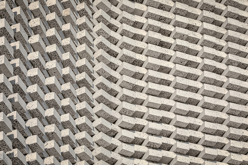
material choices contribute to passive thermal moderation
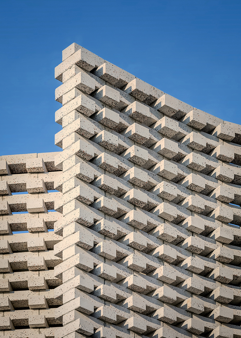
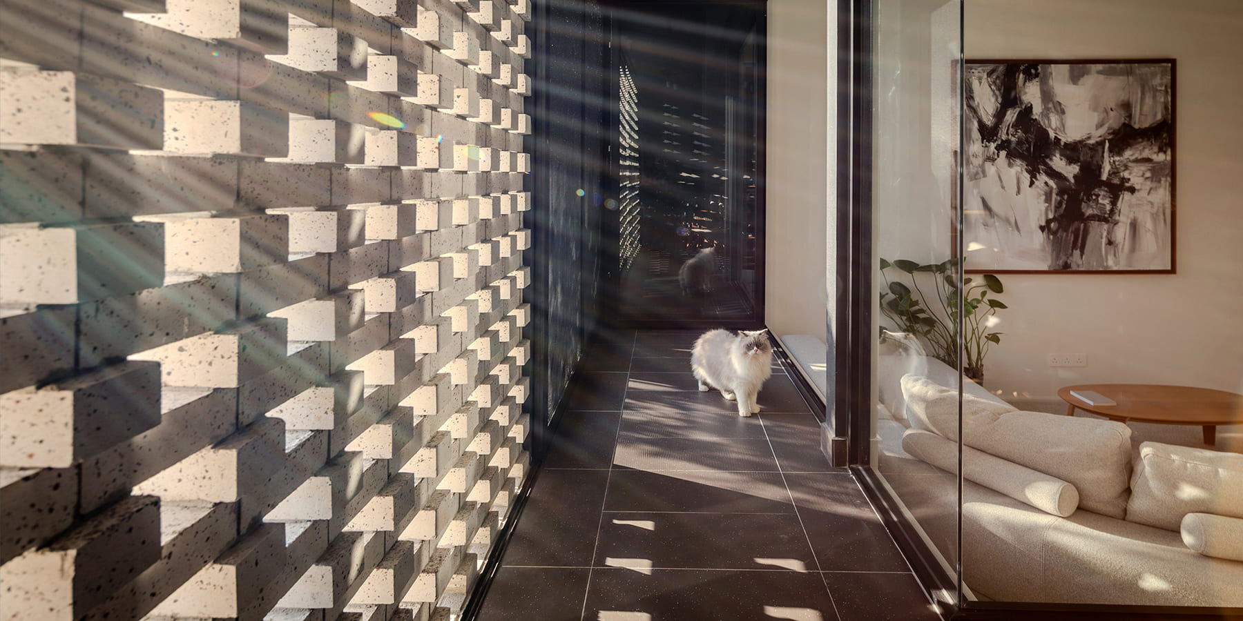
porous white brickwork filters tropical light into a play of breeze and shadow
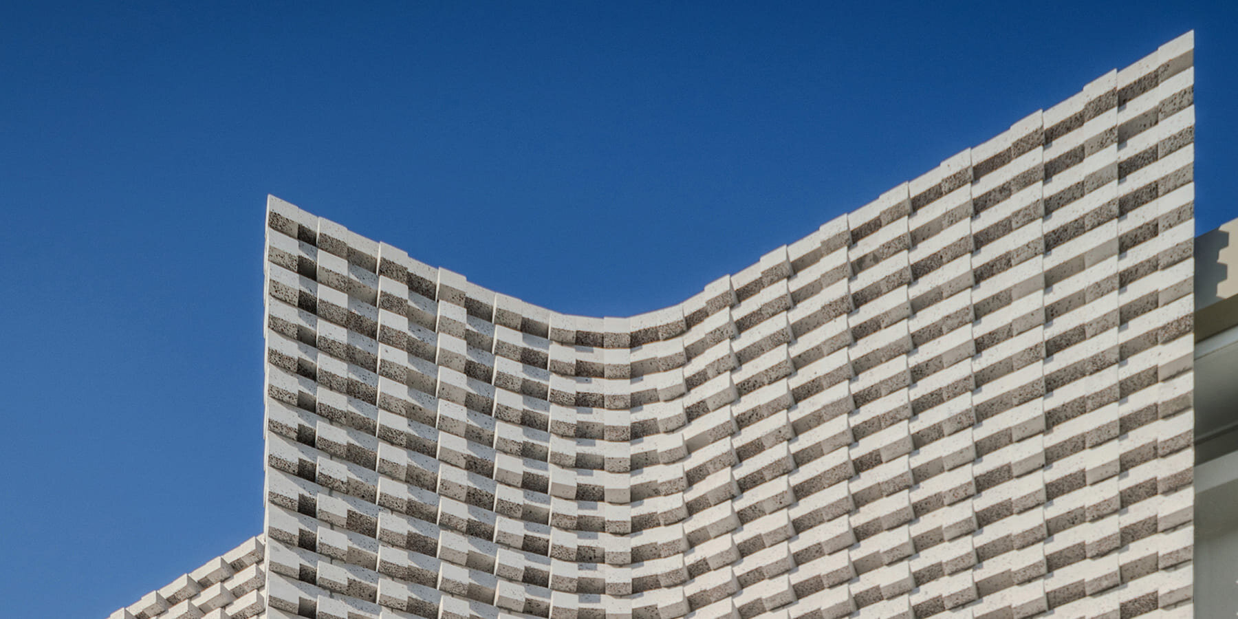
a secondary facade skin helps reduce heat gain

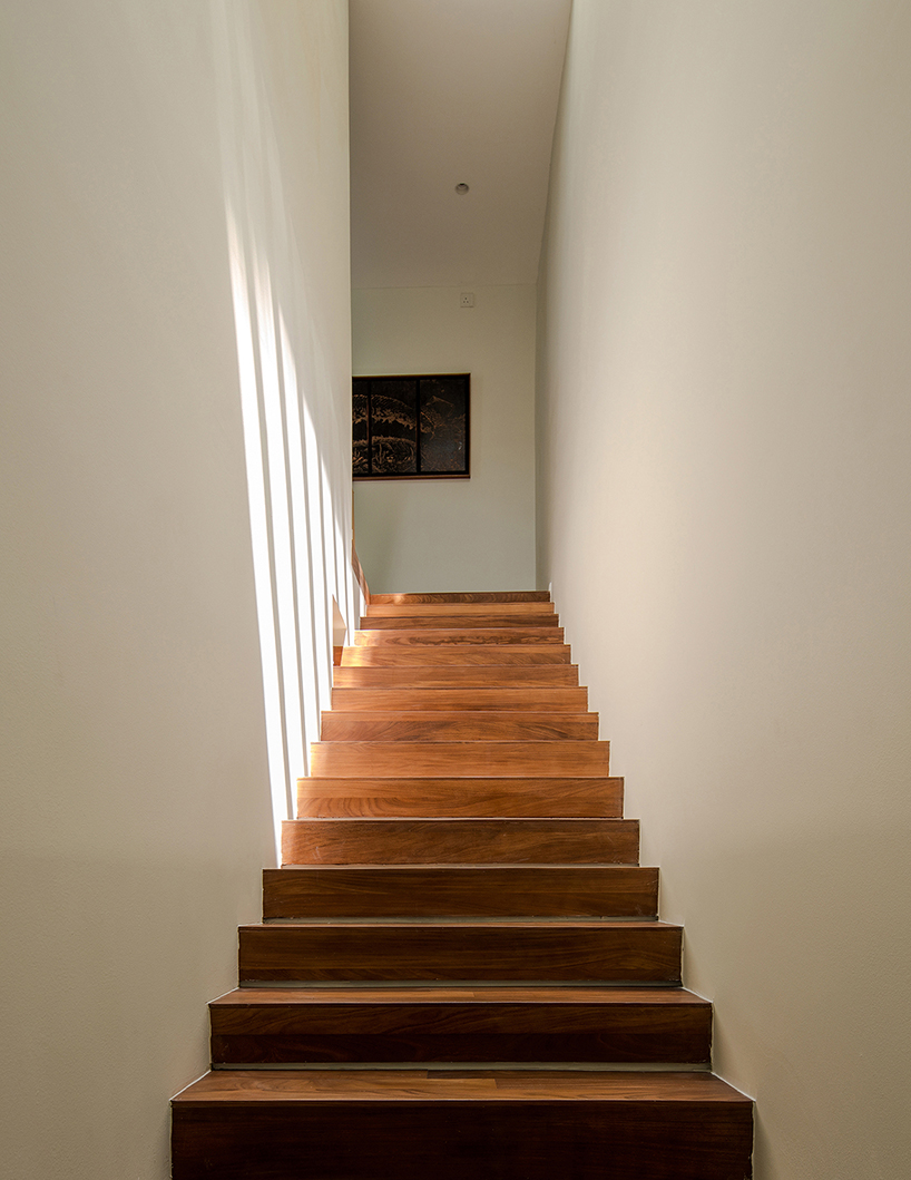
an airwell forms the central organizing element of the house
soft daylight streams into the living room, casting a luminous glow that lifts the entire home

daylight and natural ventilation circulate through the interior via the airwell
brick, timber, and concrete define the project’s material palette

open communal spaces connect the living room and kitchen
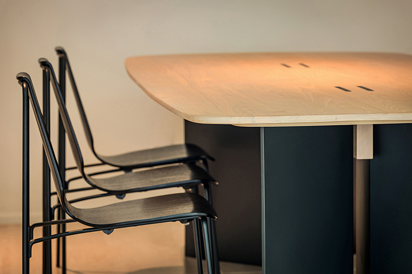
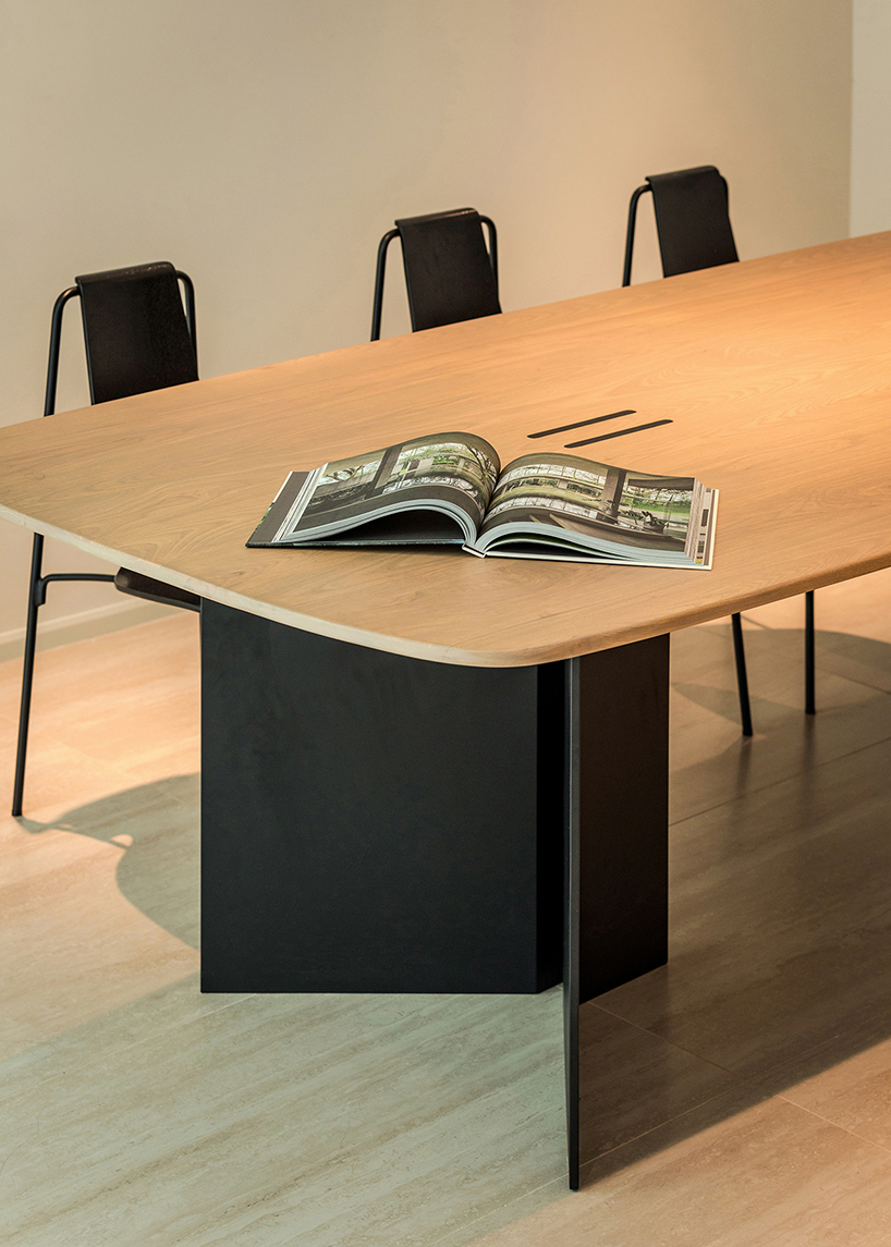
the customized dining table becomes a refined centerpiece
6IX Design Office positions the renovation as a model for contemporary living
project info:
name: Teresformasi
architect: 6IX Design Office | @6ixdo
lead architect: Suffian Shahabuddin, Wani Khairi
location: Melawati, Kuala Lumpur, Malaysia
designboom has received this project from our DIY submissions feature, where we welcome our readers to submit their own work for publication. see more project submissions from our readers here.
edited by: christina vergopoulou | designboom
The post porous white brickwork facade enfolds renovated 1980s terrace house in kuala lumpur appeared first on designboom | architecture & design magazine.


 Air Shed, Arup
 Speed Shed, PAU
 Wide Baseline Shed, PAU